
LCCA Brand Illustration
Concept-led illustration for brand identity and communication
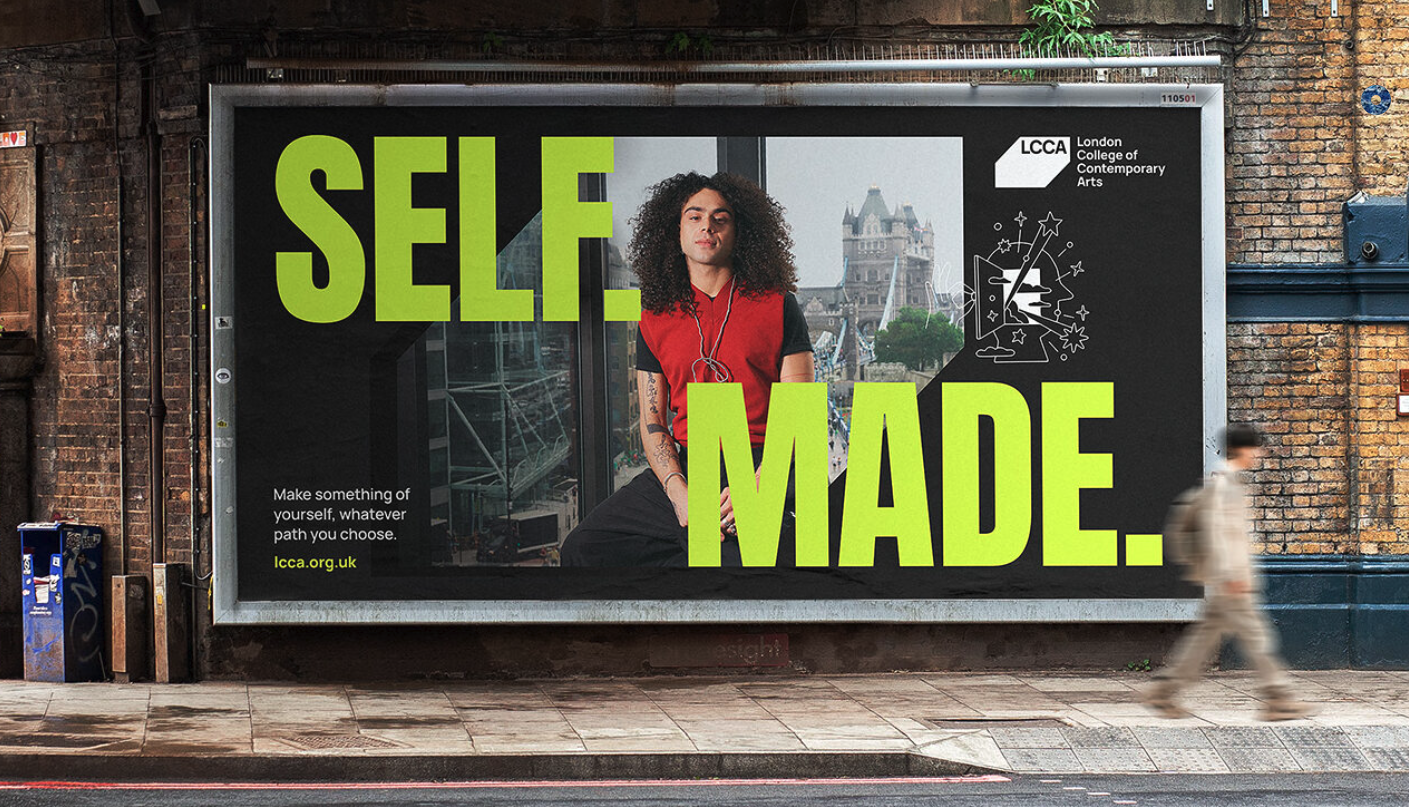
I worked with Keel London to create a series of illustrations for the London College of Contemporary Arts (LCCA), as part of a wider brand transformation. The aim was to develop a visual language that could help communicate the energy, ambition and creative mindset of the institution.
Client: LCCA (via Keel London)
Project type: Brand illustration
Role: Illustrator
Usage: Brand identity, campaigns, digital and print
Focus: Communicating creativity, ambition and real-world experience
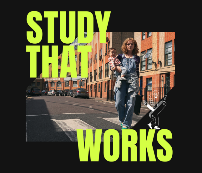


Brief: Create a series of illustrations that could support the new brand direction and help bring key messages to life across multiple touchpoints.
The work needed to feel:
Creative and expressive
Accessible and clear
Relevant to students and future applicants
The challenge was to communicate a broad and varied creative offering — from fashion to business to digital — without becoming overly complex or generic.
The illustrations needed to:
Work across different subjects
Feel unified as a system
Remain simple and easy to understand
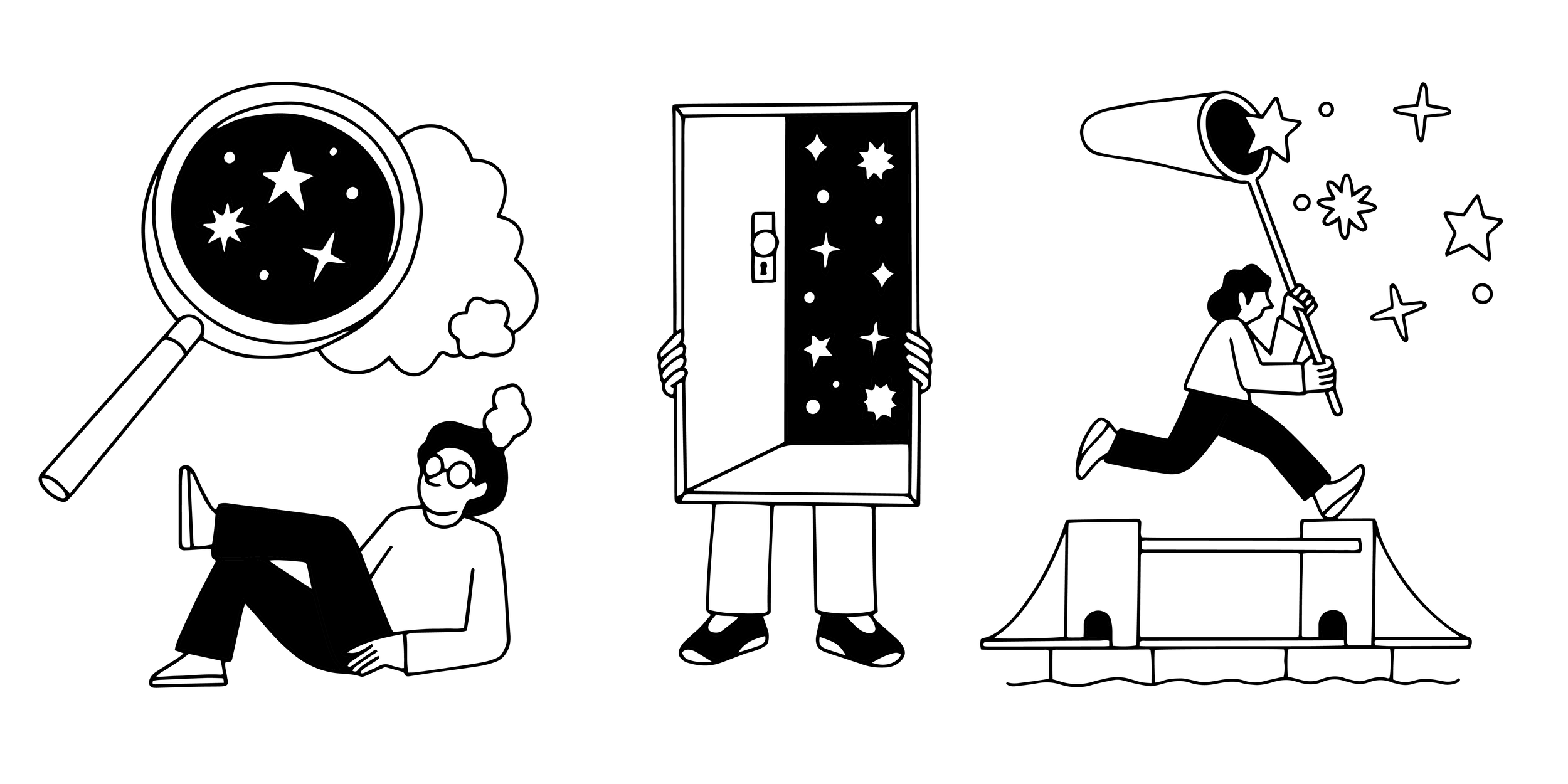
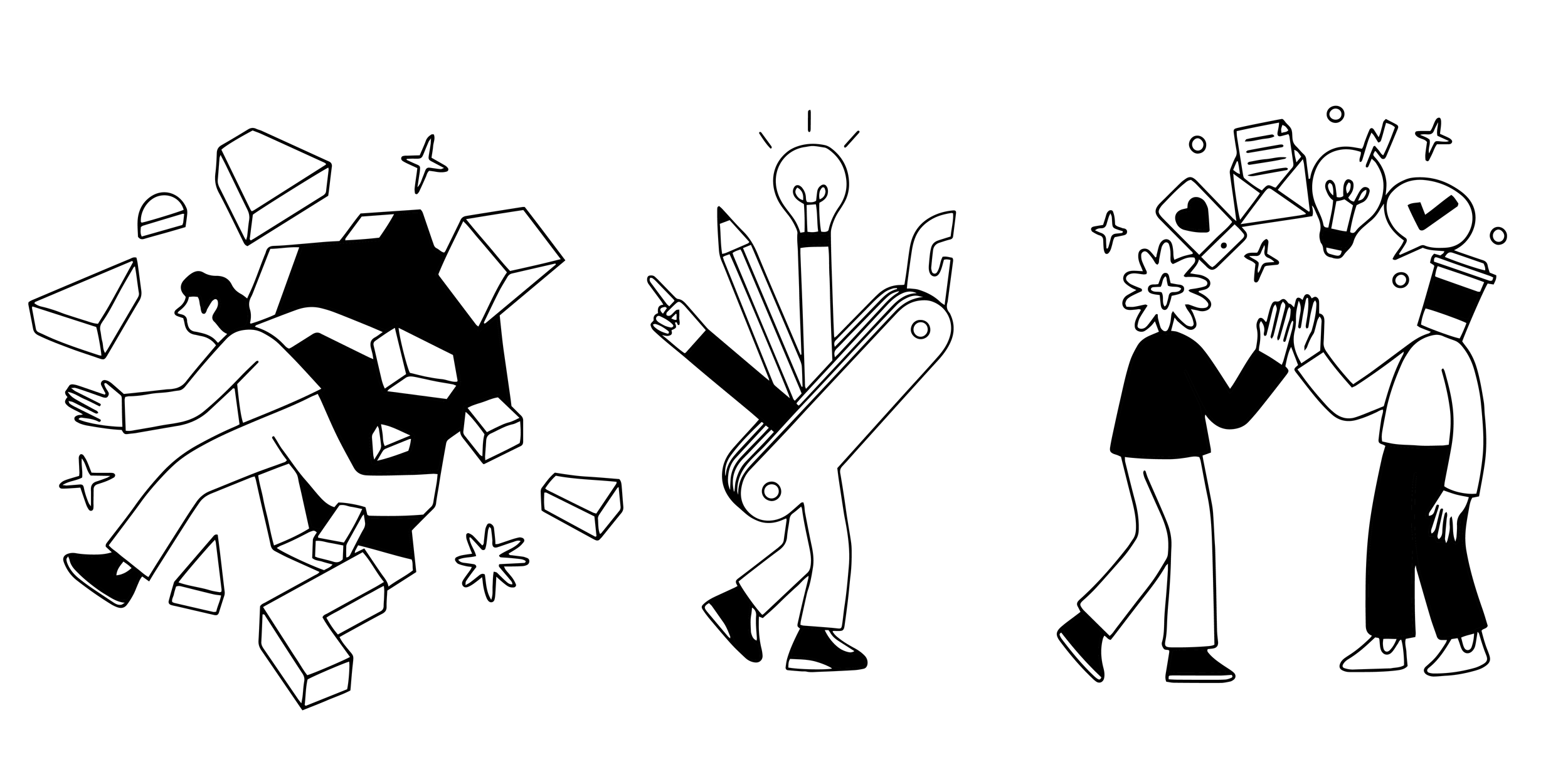
I focused on developing simple, concept-led visuals that could represent ideas around creativity, growth and real-world experience.
Rather than illustrating subjects literally, the aim was to create images that felt open, interpretive and easy to connect with.
The work balances abstraction with familiarity, allowing it to communicate clearly while still feeling distinctive.
The aim wasn’t to create detailed visuals, but to find the simplest version of each idea that still felt engaging and meaningful.
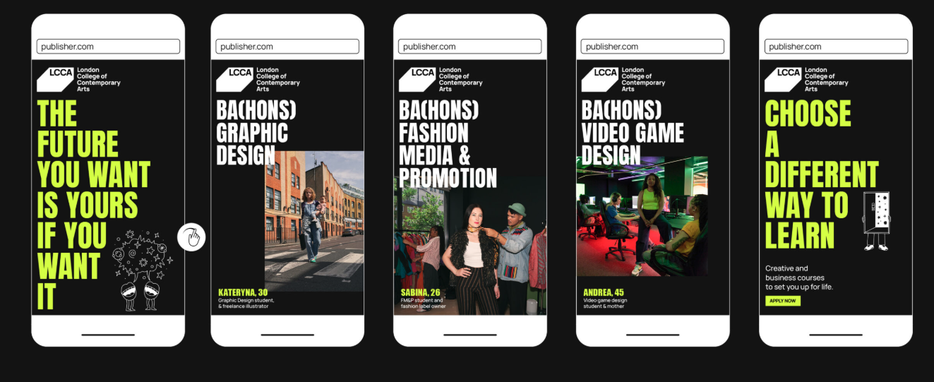
The final illustrations became part of a wider brand system developed by Keel, used across LCCA’s communications to support messaging and create a more engaging, recognisable visual identity.
The work helps bring clarity and personality to the brand, making it easier to communicate what LCCA offers and what it stands for.